My heart is broken, again.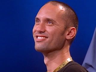
Gosh, what a dissapointing episode. Sorry if you all loved it, I was just put off.
They tell the designers to make dresses out of plants, and somehow expect them to not be a bit tacky? They're allowed the usual hundred dollars, and the judges expect a gown made entirely of flowers? Excuse me, have you ever tried to buy flowers? In a high-quality shop in Manhattan, no less?
I wish the judges got a closer look at the construction, especially in a delicate task like this. I thought Chloe's poor planning deserved to get her aufed. I'm not nuts about Chloe. Honestly, I've gotten bored with her. I was hoping she was aufed this week. Chloe had a lucky break and a helping hand from another designer. I know people thought it was Kara's turn, but I quite like her. Come on, now- "I've got a pile of green, and all I want to do it smoke it, honestly." I think she should have won this challenge. Daniel V's was nice, and I suppose he had a more solid direction as he was working, but Kara's looked the most like a real garment. Oh well, I guess the judges just can't get past their Vosovic fetish.
Andrae, my dear Andrae- he had an idea, a plan, a concept. The one complaint I agreed with was that it looked stiff, in the sense of uncomfortable. However, he did have that specific shape in mind. He wasn't trying to make a voluptous piece. He acheived exactly what he was trying for. It was sophisticated, and a smart selection and application of materials. Tim Gunn agrees with me, but, alas, someone had to be out, and as the judges don't get an eyeful of the process, Andrae's modest piece ended up at the bottom.
I mildly hoped Santino won, just so we could see a dress covered in neon f-bombs or something next week. His dress was passable this week, I liked that he used some interesting materials. I totally did not understand Michael Kors' comment to Heidi.
"I don't mind that it's shiny."
"Cause you're German!"
What? Are all Germans tacky or something? Is Michael Kors a racist? Was this some kind of joke that flew over my head? Perhaps Germans really do like shiny things. I'm not up to date on my German culture, I guess. The only thing I could think of that's shiny and associated with Germans were, uh, boots. Forgive me.
Also, I thought, funnier than Santino imitating Tim Gunn and Andrae having a date at Red Lobster (which was admittedly hilarious): Tim Gunn uttering "veklempt".
There was, this episode, what I believe is Project Runway's first discussion about homosexuality (well, besides Raymundo's ramble at his audition). Daniel, Nick and Chloe talk about coming out; and not on the air, bisexuality and et cetera. Daniel explains that he's about "eighty-twenty" (that's 5 on the Kinsey Scale). I fear the fangirls will glean too much hope from this- I imagine they'll be at his door any day now. (By the way, keep an eye out behind Nick- they have Emmett's shirt set up on a form at his workspace. How sweet.)
It was kind of a nice moment. I always liked what an overtly gay-friendly show Project Runway is- putting aside the painful fact that everyone assumes fashion designers are gay, anyway. Other reality shows tend to have just one gay person or couple for the sake of being diverse, and occasionally include some sort of drama (OMG one of the top models is a lesbian!?) or implied level of discomfort (just about every season of The Real World, ever) about it. Then, of course, there's the ill-fated gay bachelor-type Boy Meets Boy, which ended up being less gay friendly than it sounds. If you don't remember it, it was your basic dating show, including your basic idiotic twist. Half of the contestants were actually straight. Project Runway has displayed several boy-loving boys each season without feeling the need to announce it. The fact that they're gay has nothing to do with what they end up creating each episode- they are portrayed as intelligent professionals with unique personalities. Sort of as Eddie Izzard (who, oh, is definitely getting several reviews here- the definition of aestheically pleasing/culturally subversive) puts it, there is a seperation between day-to-day life and work and sexual orientation. "You're gay, and you work in a library? Well, you must shag the books."
Well, with all of that said, it was nice that when there was finally a mention of lifestyle, something meaningful was said. It was moving to remember that just because one is a fashion designer doesn't mean one grew up in a gay-friendly environment.
Also, I feel like Chloe showed her, um, bubble-headedness in these discussions. This might be another reason I grow weary of her.
"Hey, should I come out as a lesbian? Hee hee hee! I'm joking! Ha ha! I'm just joking, you guys."
"I have this bisexual friend- he's so interesting. He's so neat. He's truly, truly bisexual."
Once again, a design evoked the over-used term "vulgar". I know I'm not the only one who feels absolutely nothing thus far deemed "vulgar" has actually been the least bit vulgar. This week it was Nick's bright little dress, the theme of which seemed to be "not Paris Hilton". Somehow, they decided this thing was super-Paris Hilton, announcing it vulgar rather than pointing out its actual flaws.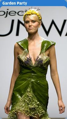
It was reminiscent of some kind of giant alien or insect. A beautiful alien, perhaps; an insect on its way to a high-end party in Manhattan. Vulgar? Where were they looking? This thing belongs in a Saturday morning cartoon. The judges also announced that everything Nick makes is vulgar. Huh, well then, they better tell Mattel to recall all of those Barbies. Unless, as it seems, vulgar is preferred to boring when being peddled to children as a role model, but wearing a short skirt to a party or not covering your leotard completely when ice-skating are no-nos.
That picture reminds me, I noticed something this episode. I don't know how it happened, but,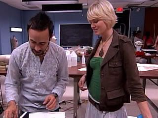
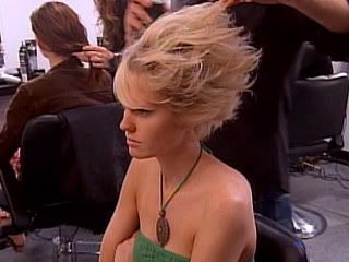
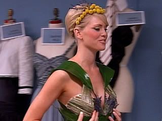
Rachael is hot...? Maybe it's Nick's special touch. Part of the muse-ification.
So, I've many times referred to Bravo's odd choice of snapshots for the official website. I've also (tresemme) mentioned (banana republic) the many blatant (Barbie) product placements in Project Runway. As if Kara perpetually holding a bottle of Dasani or name-dropping Banana Republic over fifty times in one episode isn't enough for you, among the personal moments and design process, whoever picks all of these pictures thought this was an appropriate addition:
Final note: you know who probably would've rocked this challenge? A certain nerd.
Wednesday, February 01, 2006
Look out for Andrae. He's our little lamb.
Posted by
R.J.
at
10:41 PM
![]()
Subscribe to:
Post Comments (Atom)


2 comments:
i like your blog.
i agree that chloe's designs are all too similar and simple, but they in the end, usually end up being one of the nicer ones. there's beauty in simplicity as kara said. and while they're simple, they are still creative enough to tell there is some thought
daniel is good, but nothing he's made has really wowed me (except for the inspiration challenge). i didn't really like this weeks. something about the placement of the flowers and the straps showing.
i think santino is very talented, but his ego annoys me. and it seems that while his designs are different from everyone elses, all of his designs are similar to one another (at least to me)
nick or andrae deserved to go this week. nick's just looked kind of odd. andrae's just seemed kind of old. and it was too much of that mossy green, no variation at all.
Chloe - overrated to me - simple little shape that she has used before -
Santino's beautiful - the judging has been so subjective - why shiny was a bad thing I don't get - Nick's was shiny, Daniel's was shiny
Daniel's overrated as usual - straps and part of bodice showing -looked unfinished to me - I don't care if it was ribbon
sorry to see Andrae go - but I guess he was the right one
Nick's I thought was the winner as it came down the runway - certainly not vulgar
Kara's - good for Kara - although if Santino had done it they would have crucified him for the cris cross top
Post a Comment